
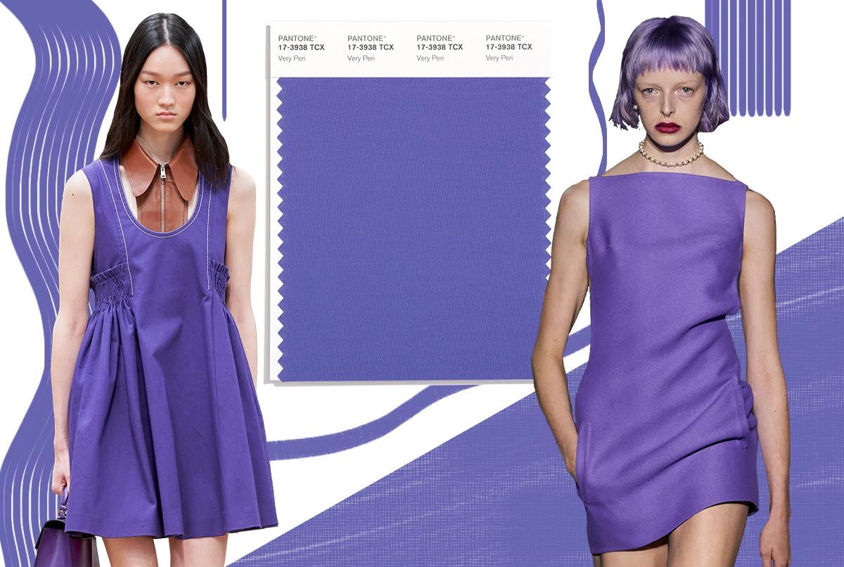
Very Peri is the moment. As already defined by PANTONE in December 2021, “a mix between the loyalty and constancy of blues and the energy and enthusiasm of reds,” also known as PANTONE 17-3938, has been gaining more and more space and pieces in the world of fashion in 2022.
By Heloísa Lima
For those who don’t know, Pantone is the institute that highlights the main seasonal colors from the runways, selects the Pantone Color of the Year, forecasts global color trends and provides consulting to companies on color matters for products and brand visual identity. Through seasonal trend forecasts, color psychology and color consulting, the Pantone Color Institute partners with global brands to effectively leverage the power, psychology and emotion of color in their design strategy.
According to Leatrice Eiseman, executive director of the Pantone Color Institute, the color for 2022 brings a joyful attitude and a dynamic presence that encourages bold creativity and the expression of imagination. Very Peri represents the return to the surface after the intense period of isolation—a return that transforms our notions and standards as we previously knew them.
Unlike previous years, Very Peri is an entirely new color created by Pantone specifically for 2022. Pantone itself states that the color is a symbol of the current global zeitgeist, helping us embrace the accelerated landscape of possibilities and opening us to a new vision as we rewrite our lives.
The process of selecting the Color of the Year involves very careful decisions and, above all, extensive trend analysis. To reach the final result year after year, experts at the Pantone Color Institute deeply study the world in search of new colors that represent society’s sentiments. This study encompasses the film industry—with movies and series in production—traveling art collections, new artists, all areas of design, famous travel destinations, emerging lifestyles and games, socioeconomic conditions, and, of course, the world of fashion.
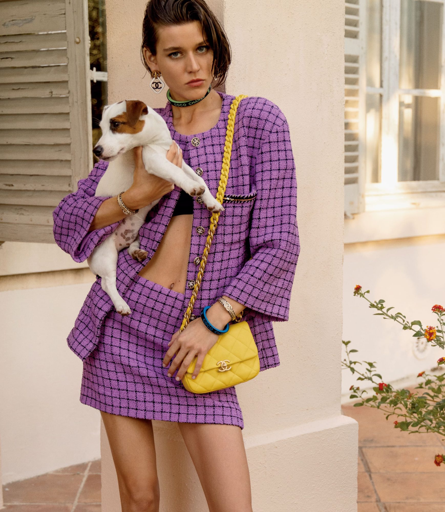
That’s why, with a scroll through your Instagram feed or a look at the Spring–Summer runways, it’s clear that Very Peri stands out completely. In the search for pieces that combine fun with a touch of boldness, brands are betting all their cards on the Color of the Year—and CHANEL is one of them.
CHANEL’s Spring–Summer 2022 collection campaign is an ode to youth whose grace resonates with the endless summer days—and just press play on the campaign video set in a village in Provence, shot by Inez & Vinoodh with model Vivienne Rohner, to see that Very Peri is here to stay. But not only that—throughout the campaign it also becomes clear that some trends from the 1980s are reclaiming their place on the runways; Virginia Viard brings the innocent, timeless joy of that decade, offering relief in times like these.
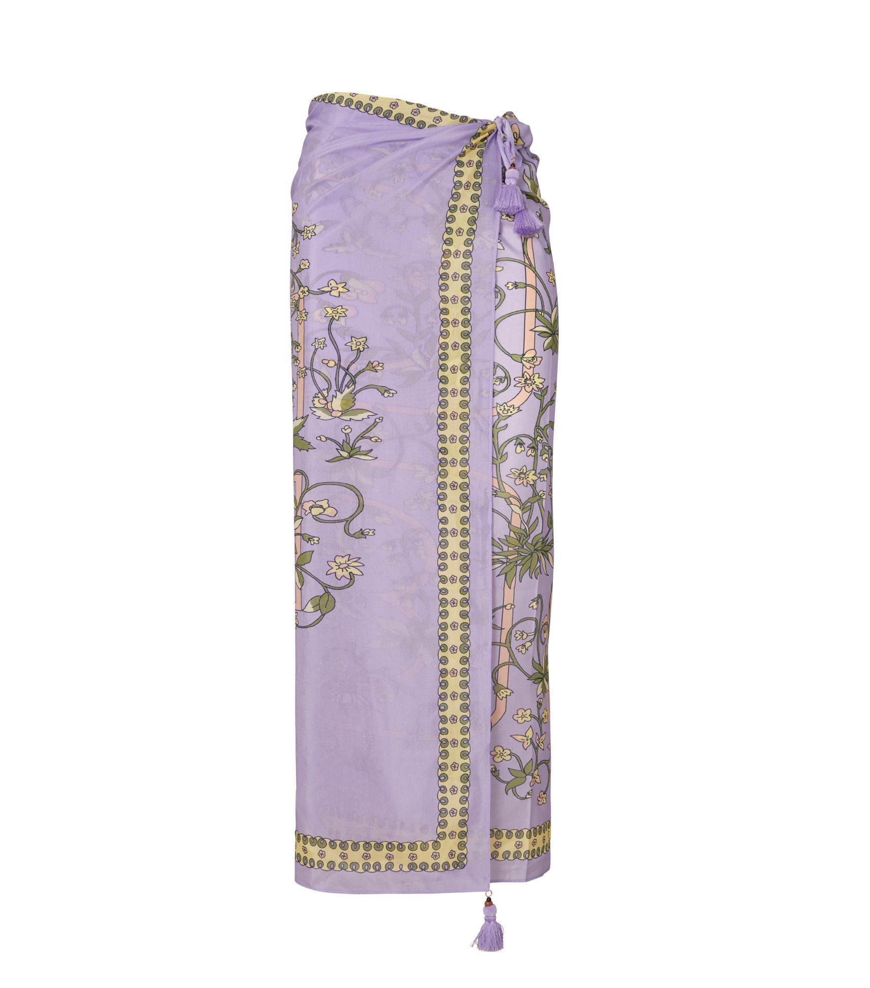
And it wasn’t only CHANEL that brought the Color of the Year to the runways; Tory Burch also designed pieces that embody all the creativity with the bold flair that Very Peri provides for Spring–Summer. The brand’s beachwear is distinguished by a violet hue and a print featuring flowers, rabbits, birds and divers, inspired by items that Tory’s own parents loved to collect.
The brand ISABEL MARANT is another that managed to use Very Peri with elegance and sophistication in its Spring–Summer pieces, which effortlessly showcase the details of the Color of the Year. The brand also created a card holder available in Very Peri as well as in Illuminating and Living Coral—the colors previously defined by PANTONE as the Color of the Year for 2021 and 2019, respectively—once again cementing the institute’s role as a trendsetter in the fashion world.
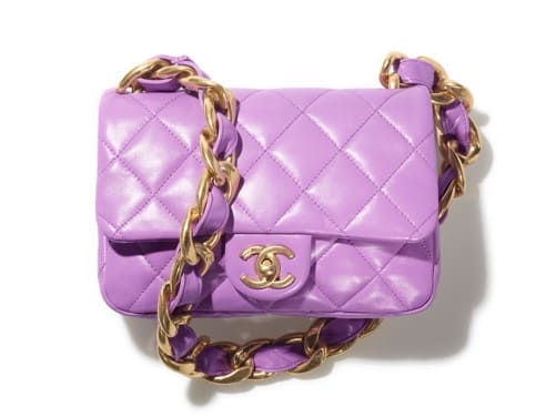
To top it off, STELLA MCCARTNEY didn’t miss the opportunity to highlight Very Peri: in some of her accessories, the Color of the Year appears representing all the meanings its creators intended—fun, youthfulness and innovation.
Of course, it doesn’t stop there—many other brands have also embraced Very Peri for their Spring–Summer lines. Don’t be afraid to take the plunge: this reddish-blue hue is the moment, and we’ll see it shine until the end of the season.
Not only in fashion but also in décor it’s possible to see shades of Very Peri gaining attention. In this sense, the Color of the Year helps create a more cheerful and optimistic space. To do this, try painting a wall in the hue or pairing it with other objects in gold or yellow tones. If you’re not comfortable straying far from the classic, adding small items in the Color of the Year also helps lift the room’s energy.
And don’t be mistaken in thinking the color will be left out of the beauty market. Colorful makeups featuring the Very Peri shade are more common than ever. With plenty of shimmer and a touch of fantasy, there are countless ways to incorporate this hue into your beauty routine. Whether with a bold eyeshadow, graphic eyeliner, or reverse liner along the eye, your look is sure to get an upgrade with this color. And for the truly daring, a Very Peri lipstick is always an option.
Capitalizing on the December 2021 release of the color, brands like Oceane, Anastasia Beverly Hills and Fenty Beauty launched several cosmetic options featuring the hue. Meanwhile, Foreo, a beauty accessory brand, didn’t hesitate to introduce a Very Peri version to complement beauty routines around the world.